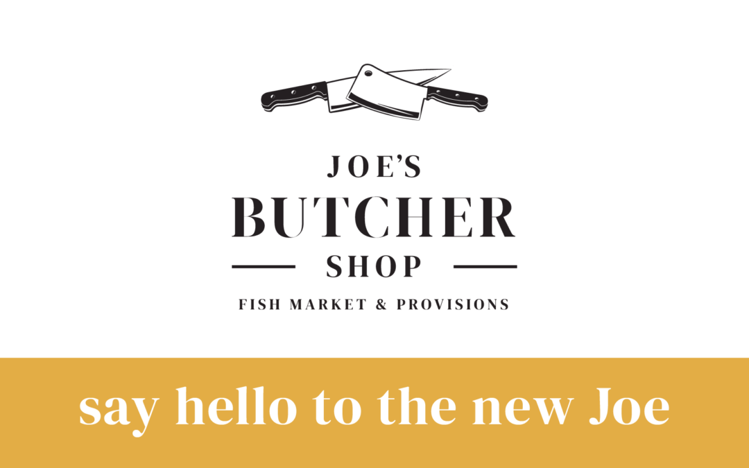
Big things are happening inside our store over the next 4-6 weeks. After 15 years of projecting the same branding and logo, we are switching things up and implementing a fresh look and feel.
The changes may seem dramatic, but they are simply cosmetic. Our core values at Joe’s aren’t changing. We are still focused on providing our customers with quality services and products. We just felt it was time to enhance our brand’s look. The new logo has hints of the familiar old logo but better reflects our role as more than just a butcher shop and fish market. The logo does this by giving a nod to the provisions we offer in the center of the isle.
The first change you will notice is that the main wall behind the beef counter will be painted a solid black with a new logo proudly displayed in the middle. Instead of using our chalkboard to highlight specials and give in-store communications, we will be using large wall-mounted butcher paper through the store that can easily be changed each week.
New and consistent signage will appear over the refrigerated and freezer sections of our store. We will also be updating our signage on the dry good isles to be consistent with the clean and professional image the new signage conveys. We will change all the signs inside our display cases to match up with the fonts and images displayed in the store.
Additionally, our window and door decals will display the new look to those on the street and project a uniform image to the public. However, our old sign at the top of our storefront will stay to always remind of us from where we came.
The biggest change you will see is that we are eliminating Joe’s Next Door as a marketing entity. Don’t worry, you will still be able to purchase our fine array of frozen products, such as lasagnas, soups and enchiladas, as well as our award-winning sandwiches and deliciously made deli sides. However, the branding of those items will return to Joe’s Butcher Shop status as we seek to end confusion on having two brands inside the same physical store. The display screens showing the sandwich menu will change to be more readable and reflect the new branding.
After 15 years of business, you might be asking “Why the change?” The original logo of Joe’s was done by Joe’s family friend with the goal of reflecting an old time look and feel. The sense of old school charm was conveyed through the faded wood, knife and cleaver on the original logo and the painting inside the store, but our business has evolved and changed. We now offer state of the art Dry Aged Prime steaks done in house to our specs, house made take home goods, new and innovative dry goods, a fine selection of gourmet wines chosen specifically by Joe to complement our proteins and we build gourmet sandwiches one by one from scratch. All of these changes have been a direct cause of your support. We wanted to commemorate everything that we have grown to be, which is what this change will do for of our store.
The new branding was developed along with our marketing partner, Klipsch Marketing and Advisors (KM&A) to stand out from the crowd and send a message of stability and quality to our customers. It provides a more professional look that we think is more reflective of the quality of our products and outstanding nature of our service. The new brand also allows us to add new products under the brand with a more uniform and consistent look. We have to admit we were a bit nervous about the changes coming to Joe’s. After all, 15 years is a long time to get used to who you were. But this transformation is more about who we are today, the message we want to convey to customers and positioning for the future. It still displays what you have come to know about Joe’s. It shows that quality, value and service never go out of style and will continue with a new look for years to come.
Sincerely,
Joe Lazzara

